Paul Crimi Product Design
Paul Crimi Product Design

Rebranding, designing, and building an ecommerce platform from scratch on Shopify for a skincare brand with a cause.
Digital Marketing | Brand Development & Brand Assets | User Experience Design (UX) | User Interface Design (UI) | Shopify Development
As society has shifted to embrace wellness ideals and sustainable practices, skincare now goes beyond the stuff you smear on your face at night. Skincare is a ritual; it’s a way to care for yourself, and when you support conscientious brands, it’s a way to care for the planet.
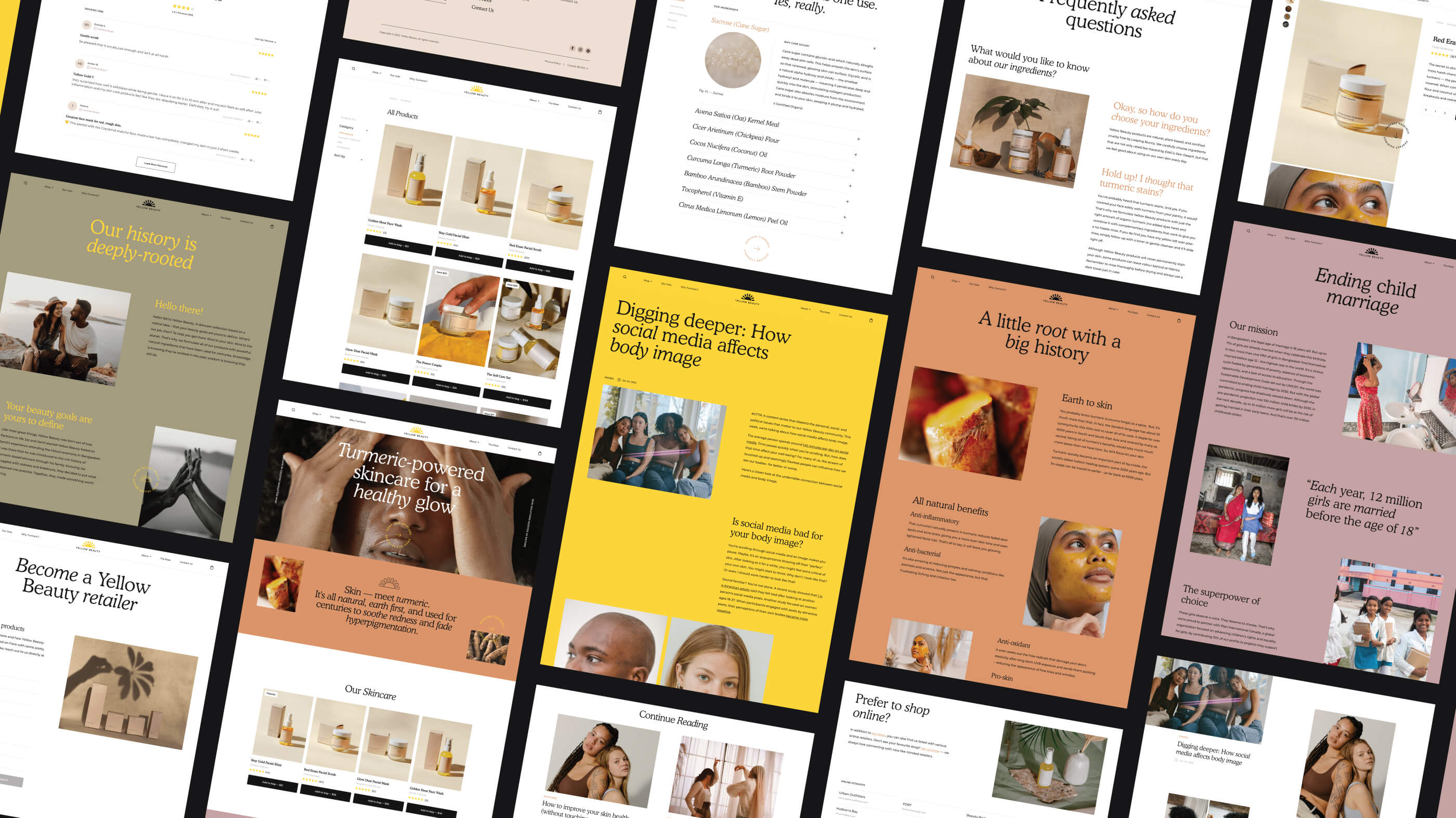
Rolling with the tide is Yellow Beauty, a clean skincare brand rooted in ayurvedic principles, and dedicated to helping individuals define beauty on their terms. The philosophies behind the brand present skincare as a journey rather than an end result. Using turmeric as a star ingredient, Yellow Beauty is a collection of skincare products designed to teach people how to love their skin.
Partners Jaz and Jamil founded the brand in 2015 after a trip to Bangladesh where, after attending a traditional Haloud (Haldi) ceremony, Jamil was introduced to the healing powers of turmeric. In line with this ode to Jamil’s homeland is the shared mission that has served as the groundwork for the brand. For every purchase made, a share of their profits goes towards ending child marriage.
Yellow Beauty: a brand born out of love, but fuelled by purpose. The phrase “cool people doing cool things?” Jaz and Jamil to a T.
From the beginning it was obvious that working with Yellow Beauty would be meaningful on a variety of levels; a shared alignment of purpose, and their passion was infectious. Initially, the relationship began because they needed to optimize their marketing efforts, and as the working relationship grew and strengthened, the responsibilities did so too. But more to come on that.
What's in a Brand?
Branding can encompass so many different ideas, which is why I want to take a moment to break down what branding means to me.
Branding is the foundation of every company. It represents a core, driving purpose. When a company or business operates from a place of intention and authenticity, they own their identity in an effortless way. The way they communicate, how they produce and consume, and how they interact with the world; it should come from a genuine place rooted in the heart of why they do the thing they do. It's simple, yet never easy. It's important, yet often misunderstood and unfortunately glossed over.
With every project undertaken, strengthening the foundational brand equity that has already been built is part of the goal. Branding is truly the essence of a company. It allows you to define who you are, and how you position yourself. Asking the important questions is necessary so that incredible products that align with a company’s interests, goals and overall identity can be built.
This is exactly what happened when Yellow Beauty was seeking to reinvigorate its brand in 2020. As their brand flourished, they sought to redefine its aesthetic and overall language.
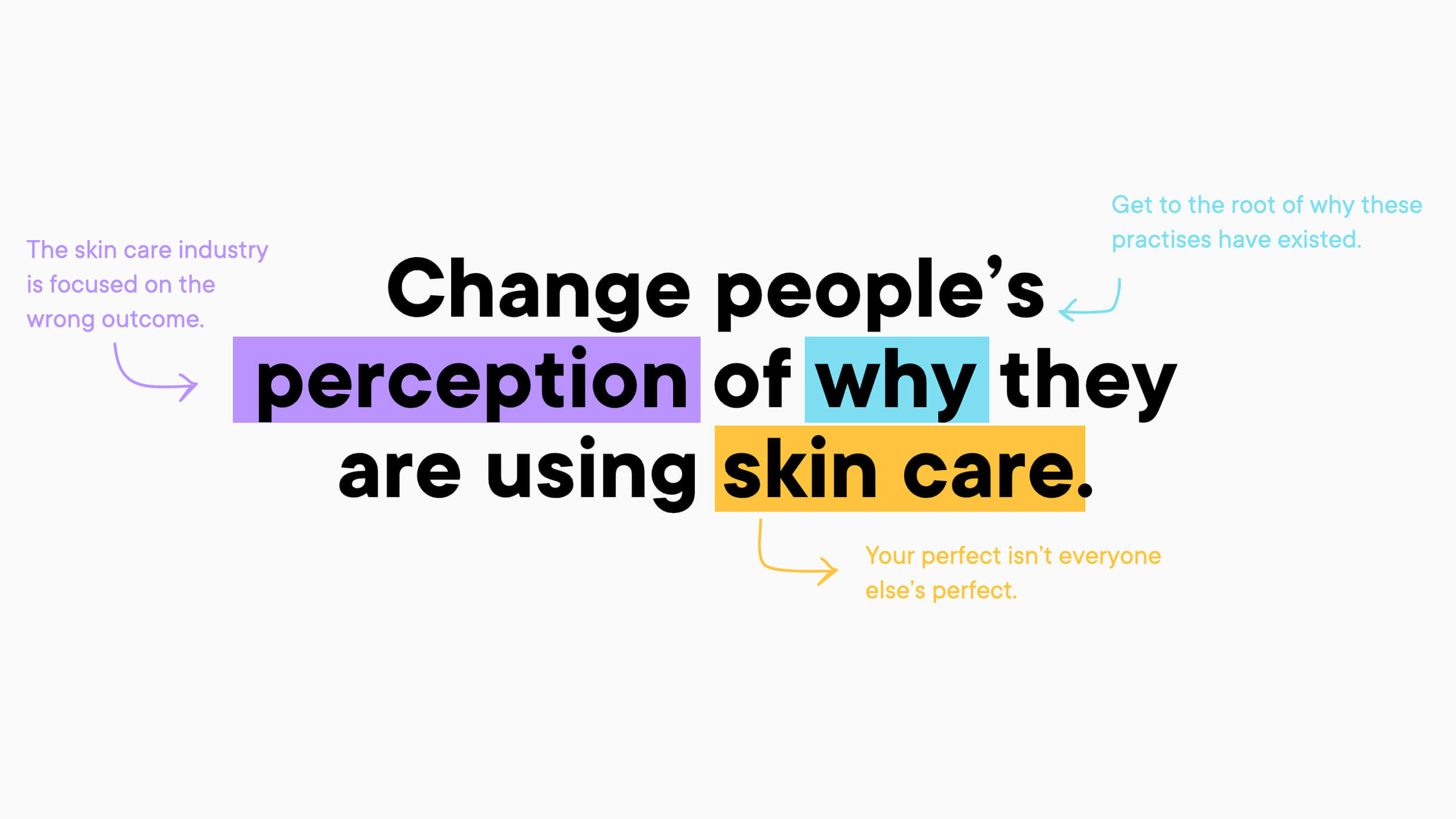
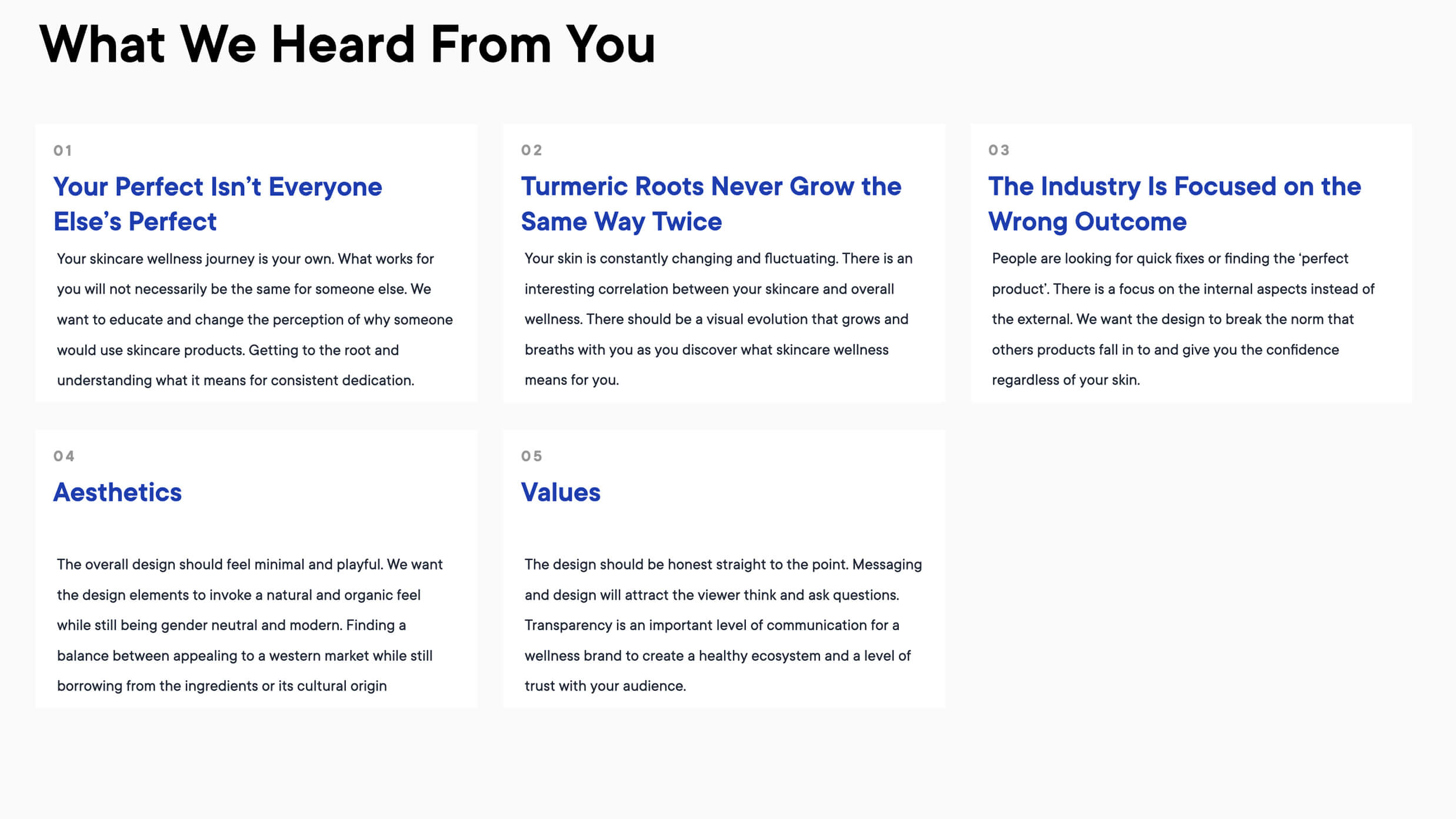
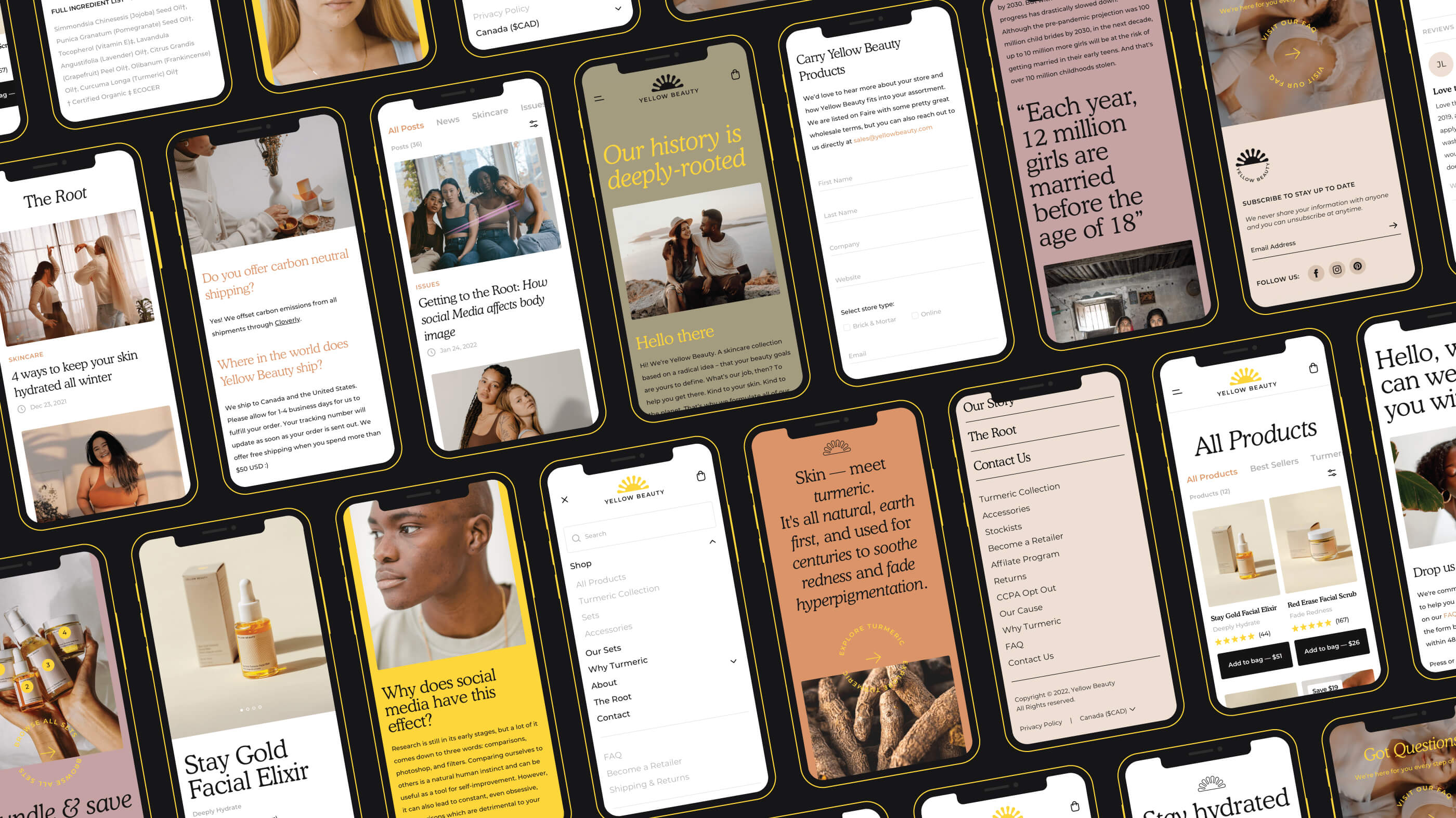
To align on these principles moving forward, a branding workshop was arranged with the team at Yellow. The core characteristics of their brand remained the same; natural, sustainable skincare with a cause. What Yellow did want to shift was their messaging. Skincare by design often focuses on an aesthetic end result, and Yellow wanted to move away from this in order to focus on wellness and skincare in a more holistic sense. Your skin is your biggest organ, and skin health is so complexly intertwined with diet, sleep, and most importantly, your mental health. Yellow Beauty sought to evolve its messaging in line with these larger ideas, while also reflecting its growth as a company.
Understanding who Yellow Beauty is and what they stand for, brand design kicked off with the first step of the creative process: moodboards. Moodboards allow you to create a visual compilation to invoke the overall feeling of each possible direction. It allows you to spotlight colours, typography, hero elements, assets, messaging, tone, and more. After a moodboard - or a combination of two - is chosen, the intent behind the moodboard is translated into the beginnings of physical designs. And so begins the process of creating a brand's design identity.
Brand Design
How many ways can you draw the sun?
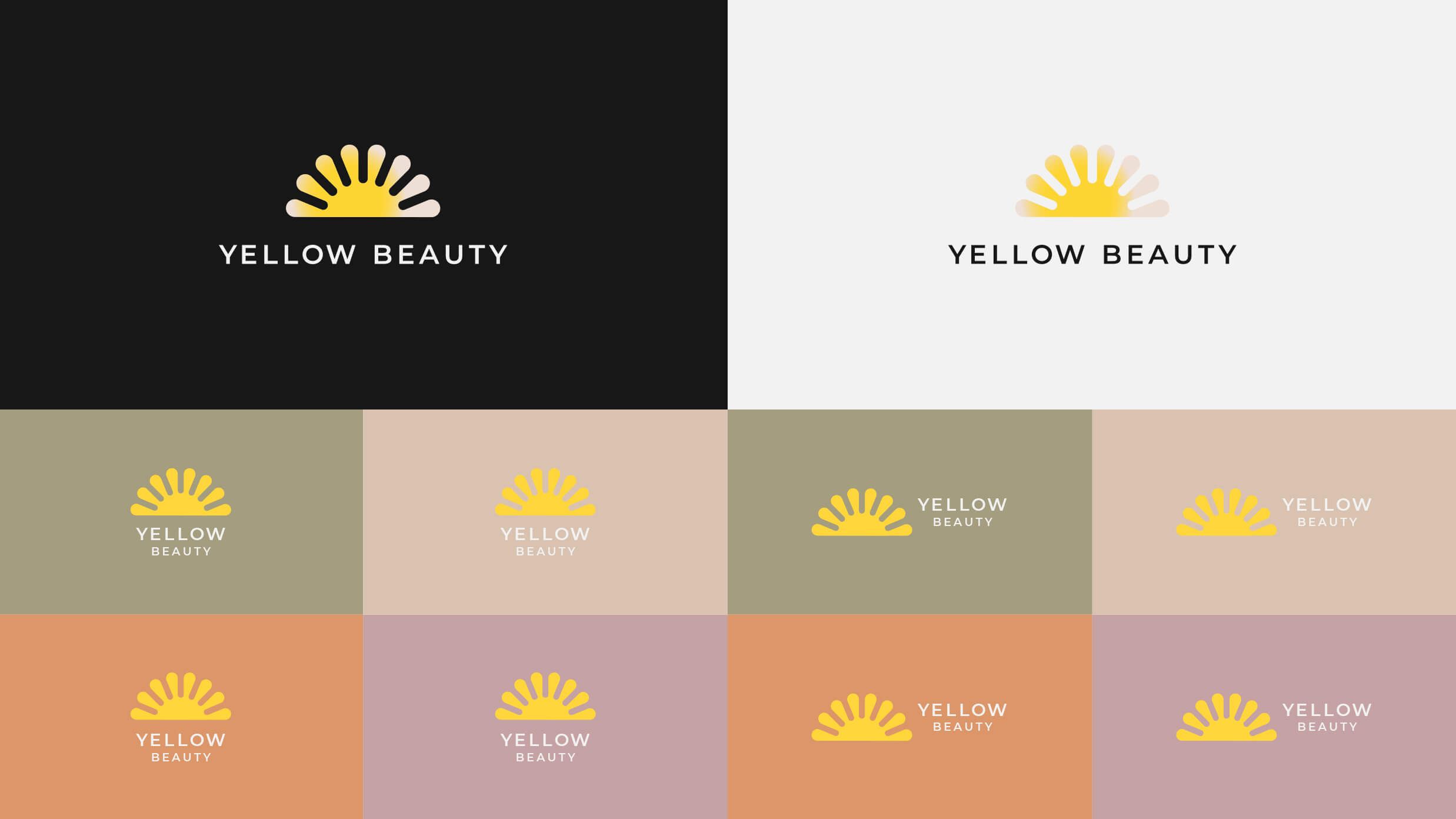
16 iterations were crafted before arriving at the perfect sun that would set the stage for Yellow Beauty’s new logo. Choosing the sun as a symbol to represent Yellow Beauty’s logo was a no-brainer. The sun has long been a powerful source of symbolism, representing the consistency and comfort nature brings with each day. The sun represents warmth, renewal, and positivity. It’s a representation of a cycle - sunrise and sunset, both the beginning and the end. Skincare as a ritual follows this old-as-time pattern. We complete our skincare routine before we begin our day, and right before we go to sleep. With Ayurveda being such a strong foundation for Yellow Beauty, their logo had to instill this sense of wellbeing, and spiritual connection to routine.
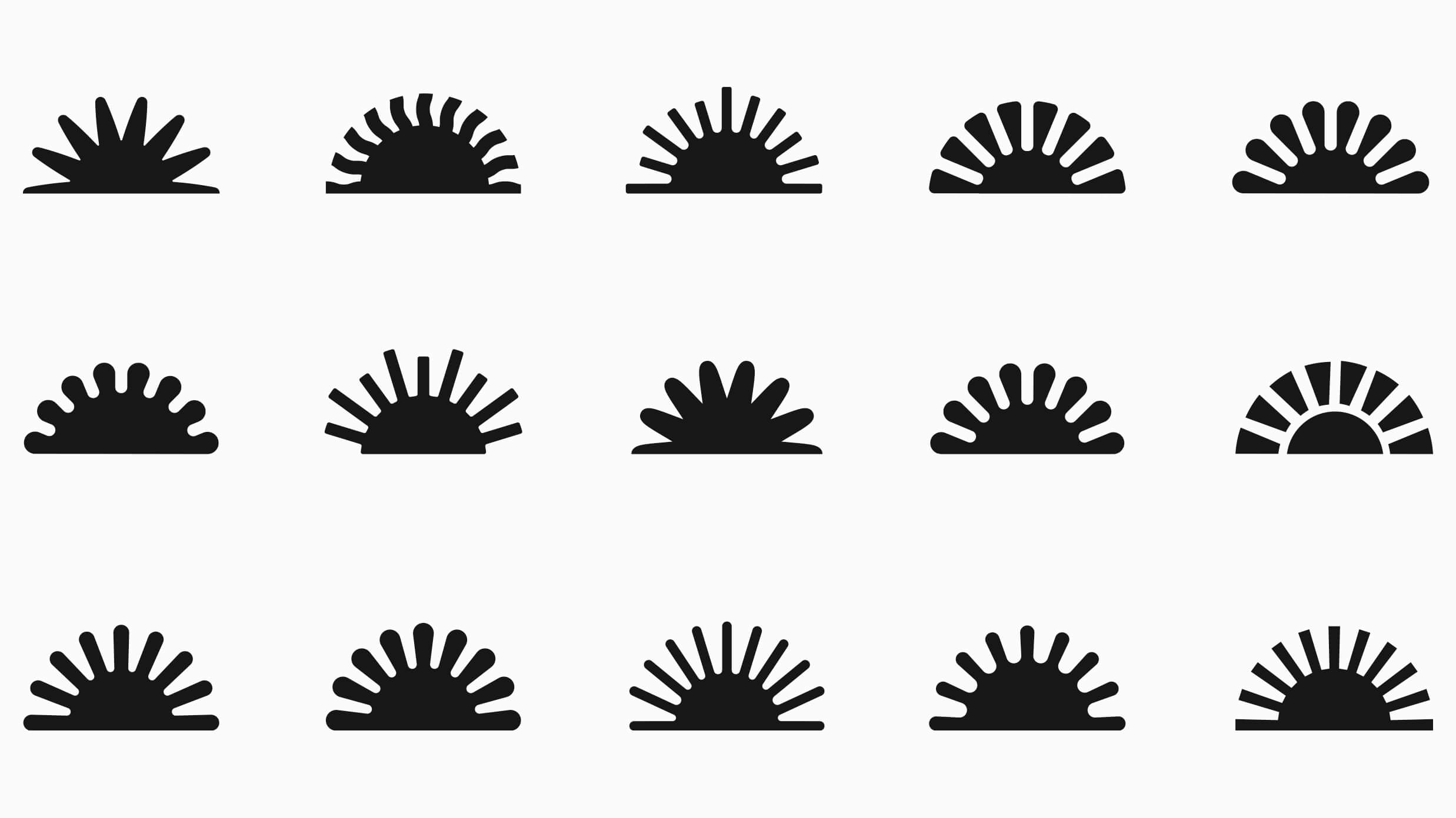
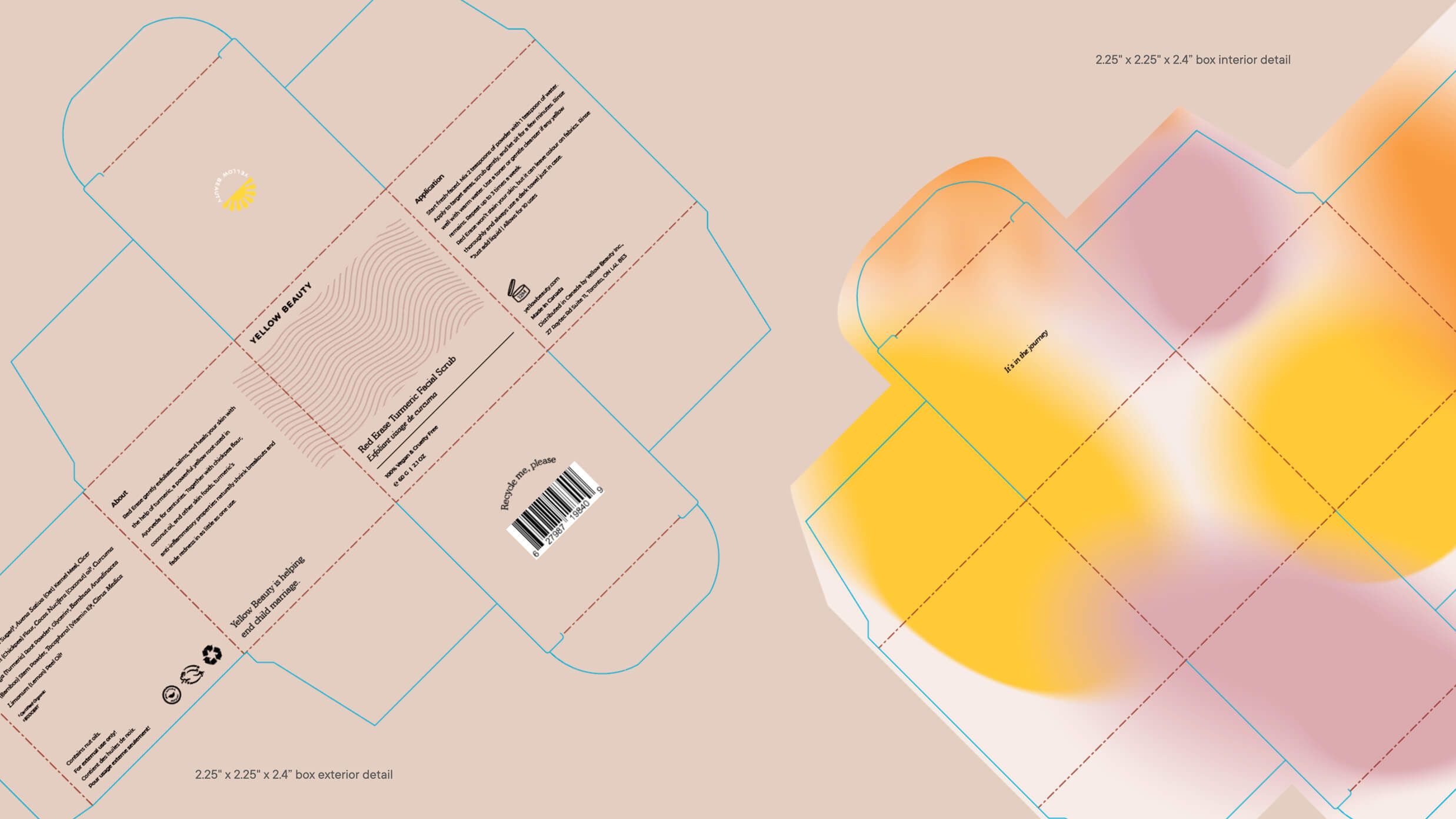
Another theme chosen to represent the brand is turmeric. Because turmeric powers every product in Yellow beauty's skincare line, it felt right to incorporate visual elements to represent this healing ingredient. By recreating the lines of the root vegetable and using the end result as a design pattern we had a strong foundation for our brand assets. These wavy lines, as seen on turmeric, also look like sun rays, connecting the two design themes seamlessly. This pattern can be seen throughout Yellow Beauty's website, social media pages, and packaging, informing their design language as a whole.
Warm, earthy colours harmonize the design, allowing all the elements to come together.
Packaging design presented another opportunity to explore the assets in a new way. When you open one of Yellow Beauty's products, you will be greeted by a warm, fuzzy gradient of colour along the inside of the box. Why? Because small surprises spread joy, even if for a moment.
Overall, Yellow Beauty was given a unique design language that reinforces its purpose and inspiring philosophies.
UX, UI & Shopify Build
When it comes to digital properties, brand design, as important as it is, needs a proper framework in order to shine.
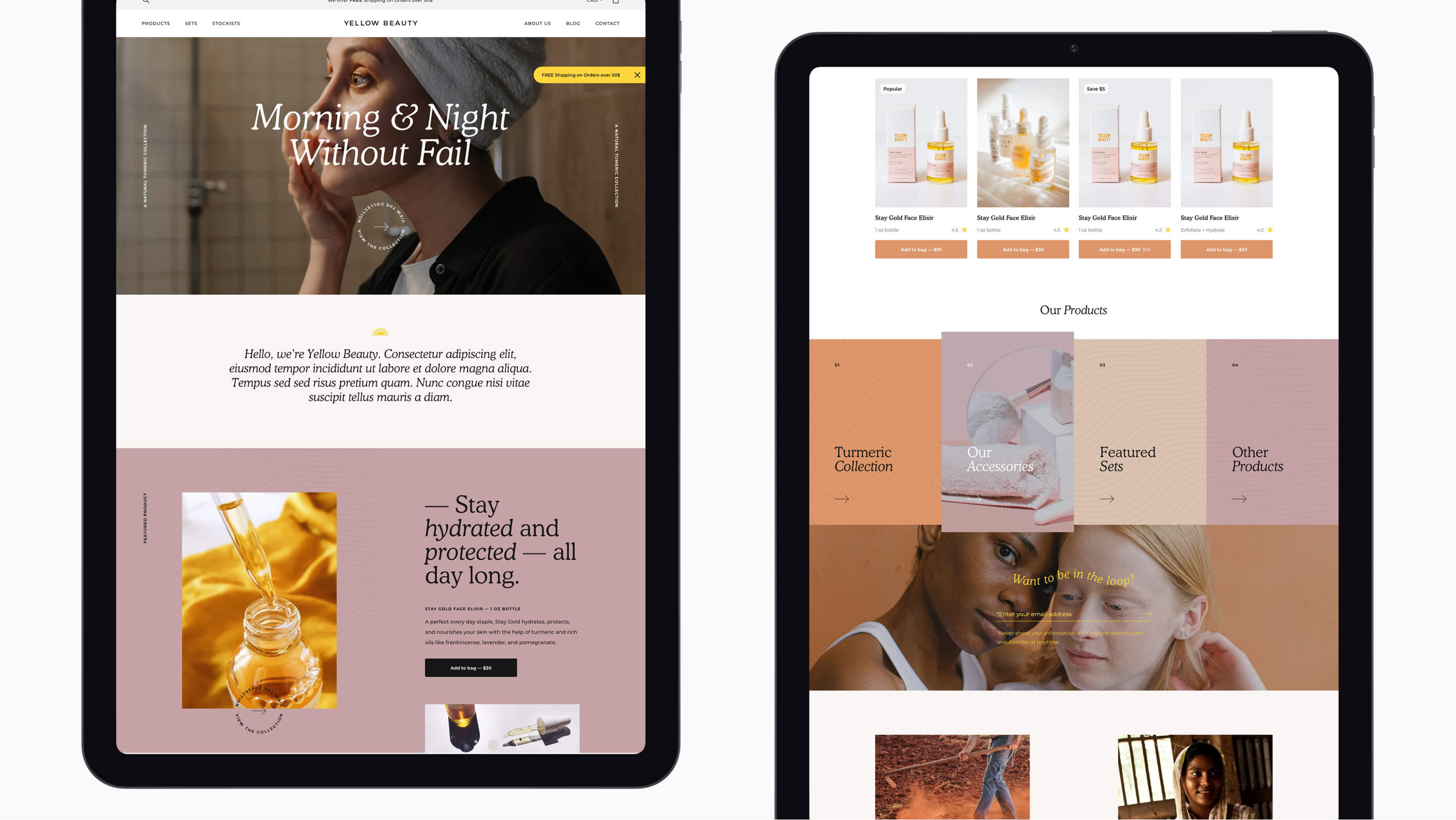
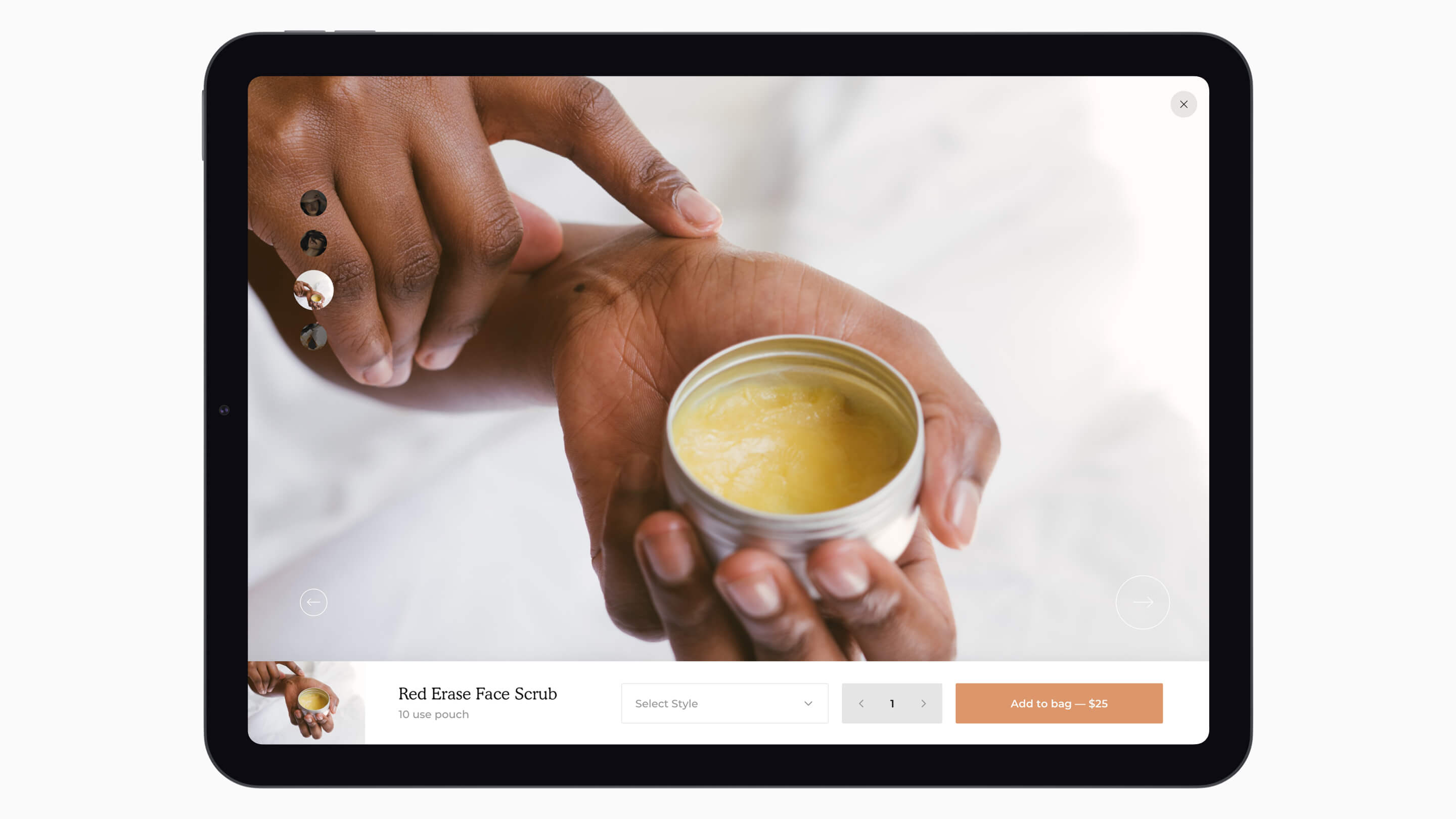
Determining features, functionality, information architecture, and information hierarchy is the beginning of the UX phase. Gathering inspiration from market research while implementing detailed feedback informed the flow of the new and improved site. Large-scale photography, gifs, and other unique elements elevated the feel of the site, as well as its function.
At this point, Yellow planned to expand its product selection - which of course informed the UX of the site. Search had to be a high-functioning feature within the design. Additionally, the hierarchy of the “add to bag bar” needed to be prominent, a move that allowed the choice to purchase to always be visually accessible on all product pages.
UX paves the way for UI design. After the architecture of a website is complete, design can then be layered on top, championing key features and allowing them to stand out even more from a visual perspective.
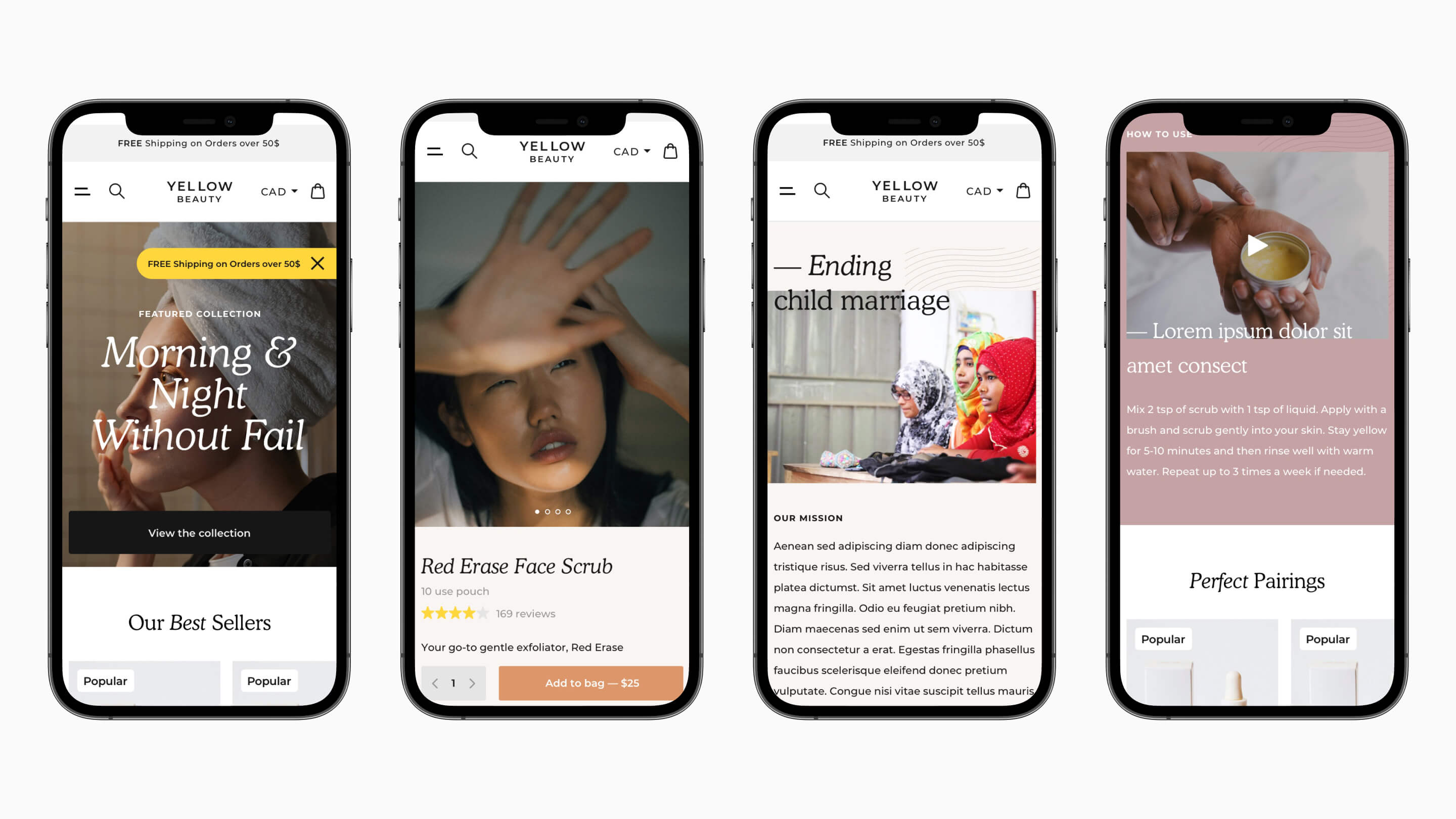
Working with development partners, a customized Shopify theme was crafted all while working within the limitations of a standard Shopify plan. A standard plan can present challenges with a lack of functionality options. To avoid this issue, the custom theme was built from scratch, allowing for a completely custom site with the desired look, feel, and features. Furthermore, the site was built in a way that allowed the integration of necessary apps, like store locator, Instagram feed and reviews.
Designing every possible liquid template, the aim was to create a site without compromising Yellow Beauty’s end vision. No single landing page, product page or blog page went untouched. Acknowledging the limitations of the Shopify plan forced us to get creative.
In the end, Yellow Beauty was given a beautiful online store they can be proud to showcase; visually pleasing with the functionality to support our marketing goals.
The Launch
Remember the excitement you would feel the night before Christmas as a kid? Or the day before your birthday? The days leading up to a new website launch feel a little like that, but with an added layer of (good-for-you) stress.
What’s special about the work with Yellow Beauty is that every team member had a hand in the project. We built an exceptional ecommerce store, defining Jaz’s vision in a way that went beyond her expectations. We created a unique design language in line with Yellow’s core brand ideals. And then we tied it all together and presented it to the world, via marketing.
Balancing a project with a number of moving parts is a shining moment for me. Throughout this project, we provided Yellow with the insights they needed to achieve large-scale success and will continue to do so because this is a brand to believe in.
This project was completed under my leadership at Digital Natives.
