Paul Crimi Product Design
Paul Crimi Product Design
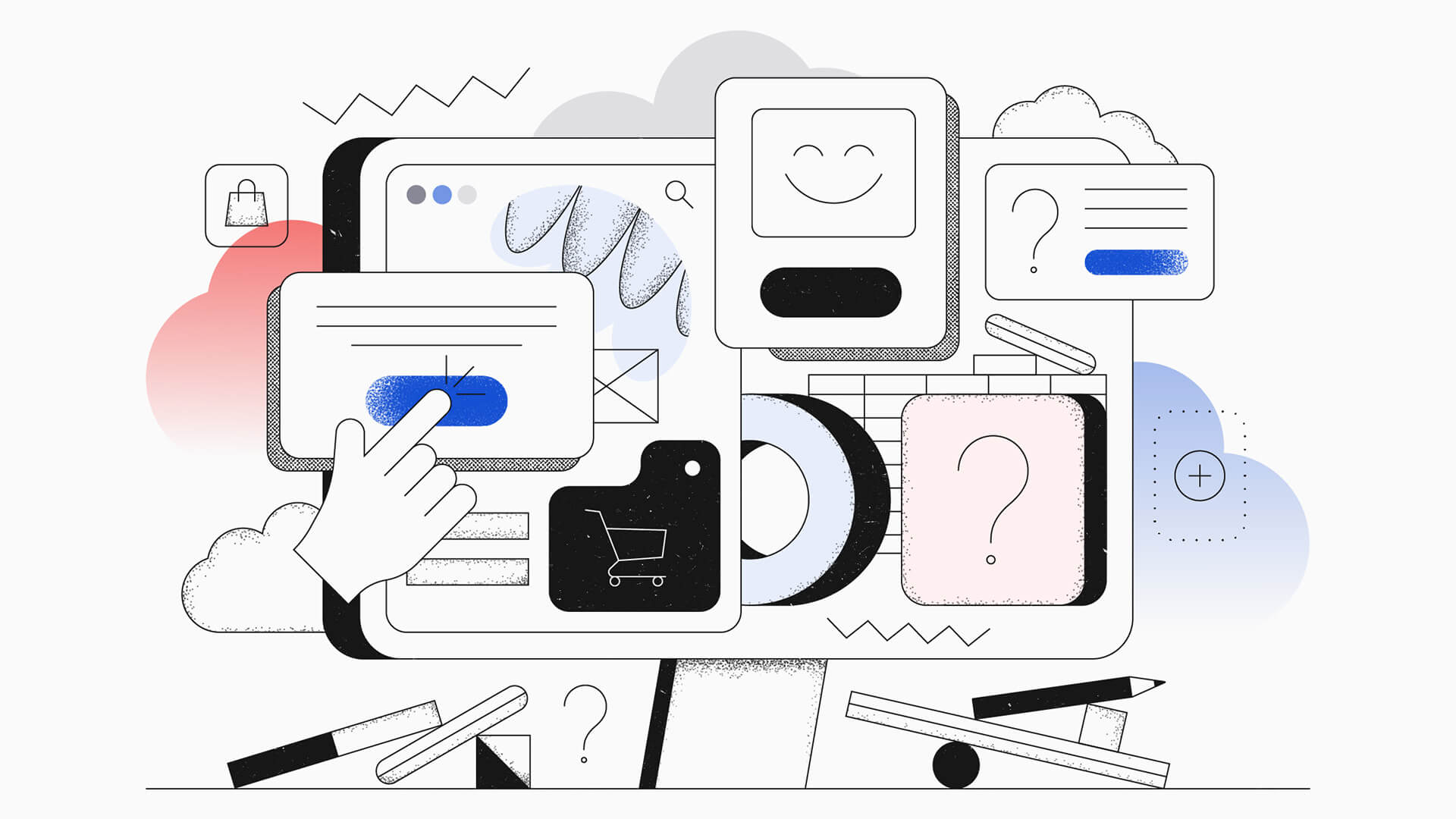
Empty States In UX/UI Design: Ever-Important but Often Forgotten
Have you ever navigated through an app or a website and found yourself directed to a blank screen, leaving you unsure of what to do next?
This could be the result of a poorly designed empty state.
Users spend time with a digital product to interact with its content. As such, it is understandable that when designing a digital product, a lot of emphasis is placed on allowing the user to enjoy and engage with the content as much as possible.
But how about those “empty state moments” in the user journey where there is no content yet available?
Today let’s take a look at empty states and why they are critical to the user experience, be it in captivating new users, or maintaining existing ones.
What Is An Empty State?
Empty states (also known as “zero state”) in UX/UI design is a page or a component of a product that has not yet been filled with content. These areas are meant to display content eventually. However, it is contingent on the completion of a certain task(s) or action(s) on the user’s end.
Some examples of states are:
- Empty checkout carts;
- 404 errors;
- No new articles a news feed;
- Empty libraries in media apps; and,
- Zero search results in a search query.
Many of the pages in these examples can simply be left as, well, empty. However, these moments possess a design opportunity to create an engaging user experience.
We can be honest; most (if not all) users do not actively seek out an empty state page.
Nobody thinks:
Oh boy, let me pull up my empty shopping cart. I would love to have a look at that!
Empty states aren’t as frequented as your ever-updating news feed or the hero page of the flagship product in an ecommerce store. As such, these areas are often overlooked.
However, these small “empty state moments” are important and are equally effective in encouraging user engagement, driving conversions, and communicating your brand values.
So how do we do that?
How to Design an Effective Empty State?
Provide Guidance
Let’s take a look at the example of a blank search results page, where a specific phrase or keyword yielded no results.
Rather than leaving your consumers gazing at a blank screen, there is a design opportunity to provide close matches to what they are looking for. This gives your users a chance to explore and engage with similar content, instead of letting them hit a brick wall.
Give Your Users An Action
Effective empty state design will inform the user of what’s happening, why it’s happening, and what they can do next.
Going off the previous point, an empty state should not lead the user to a dead-end, and should always have an action. For example, a CTA button can be used to relieve the user’s cognitive load by offering them an easy way to proceed.
This is especially important for new users of your digital product.
For first-time users, learning how to navigate an interface and figuring out how to proceed with certain actions can be difficult. This can be alleviated by implementing simple-to-follow actions to help users get started and understand the product’s functionalities.
Add Personality!
Empty states are usually either devoid of content or are displaying information of an error due to some sort of technical difficulty. Both of these scenarios are generally perceived negatively by the user.
So how do we take a blank screen or error message and prevent it from being monotonous and uninteresting?
Some of you (I dare say) older readers might remember this from the early 2000’s:
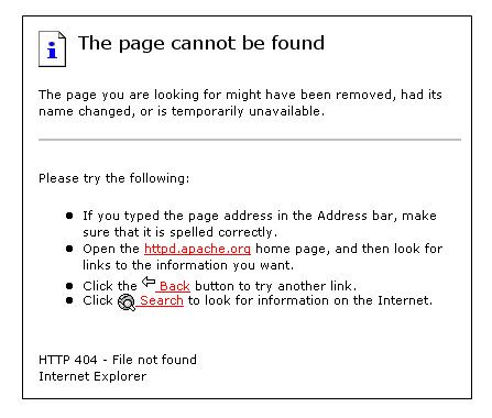
Yeesh.
Sure, there’s a bit of guidance and some CTA’s in there, but let’s compare it to this one:
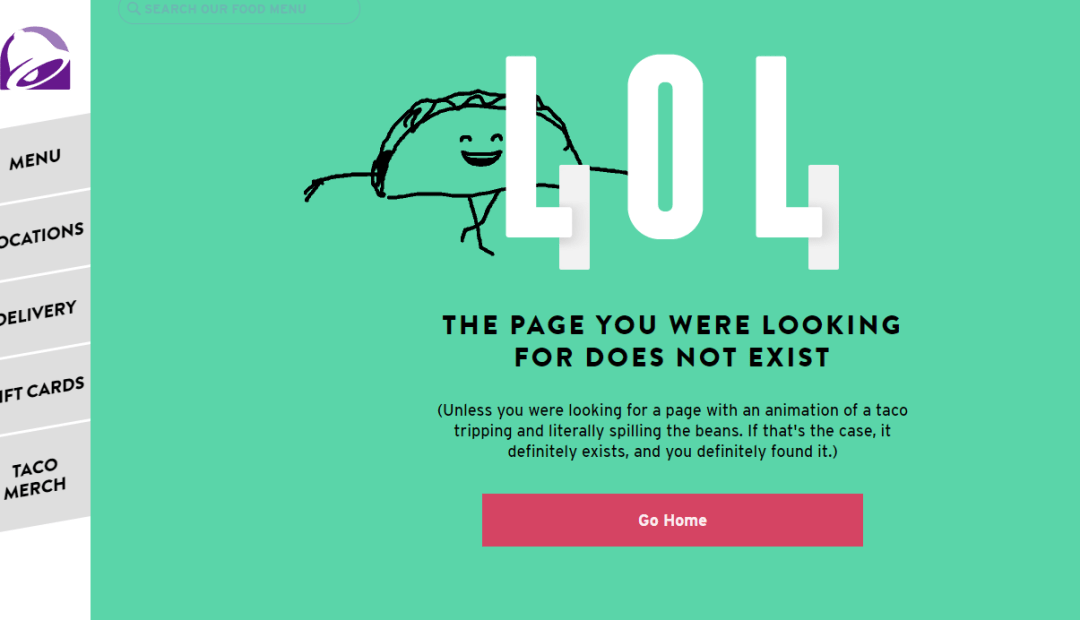
Adding personality and charm is a clever technique to improve a negative experience such as a 404 error, into a memorable one. Crafting memorable copy and illustrations can go a long way in generating a positive user experience.
What Are the Results of Bad Empty State Design?
When considering the user experience of a digital product, it is usually the first interaction that feels the most daunting. New users of any digital product may feel dissuaded from learning and adopting a new platform if they aren’t provided with proper guidance during the onboarding process.
Think about the last several times that you downloaded a new app on your phone, or signed up for a new account on a website.
Did you feel comfortably guided through the onboarding process on every occasion?
Have you ever just given up on using an app because you couldn’t be bothered to figure out how to navigate its interface?
The negative effects of a “bad” empty state are accentuated on new users.
Consider empty states as a vast waiting room. Users in this area are seeking direction through your digital product. Failure to guide users will result in the aforementioned “dead end”, leaving them confused (and potentially frustrated).
These negative experiences can drive a user away outright.